Being in Paris for two weeks before Christmas, I had the opportunity to see the latest Louvre exhibition dedicated to a region of the Islamic world, Uzbekistan. Friends previously gave me feedback regarding the exhibit, but I went with an open mind, and left with conflicting thoughts.
The exhibition is installed in a small space of the Richelieu aisle, after a flight of stairs that create a dramatic entrance. The first text panel is placed at the bottom of the stairs and gives the chronological limits of the exhibit, as well as the ambition of the project: 3rd c. BC- 16th c. AD, but the first object displayed is dated from the 3rd millennium BC. The whole exhibition is set in two rooms, a small first and a larger second, separated by a narrow. The installation is quite minimalistic, with a sober teal blue scheme colour and barely visible geometrical patterns repeating on the walls (This is beside the point, but every time I see geometrical patterns in connexion to Islamic arts, the wise words of Miranda Priestly come to mind: “Flowers, for spring? Groundbreaking.”1). There are a few explicative panels on the walls, which I’m not too mad about, but creates a bigger issue I talk about below, and the exhibition includes a small screen and a massive projection in the second room.
I realise, writing this blog, that I took very few pictures during my visit, as I wanted to “take it in” and not spend the entire time stuck to my phone. I’ll do my best to describe from memory, but you can also buy the exhibition catalogue for all the reproductions.

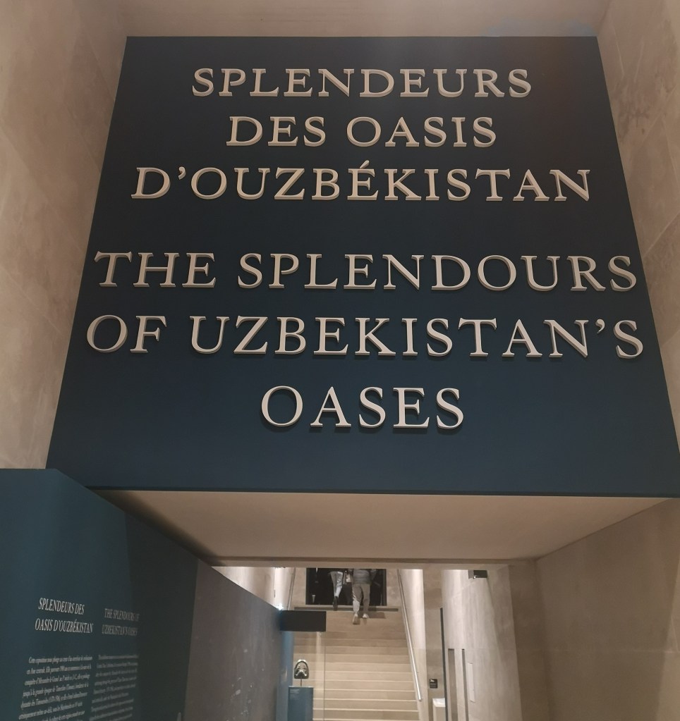
Splendours of Uzbekistan from Uzbekistan

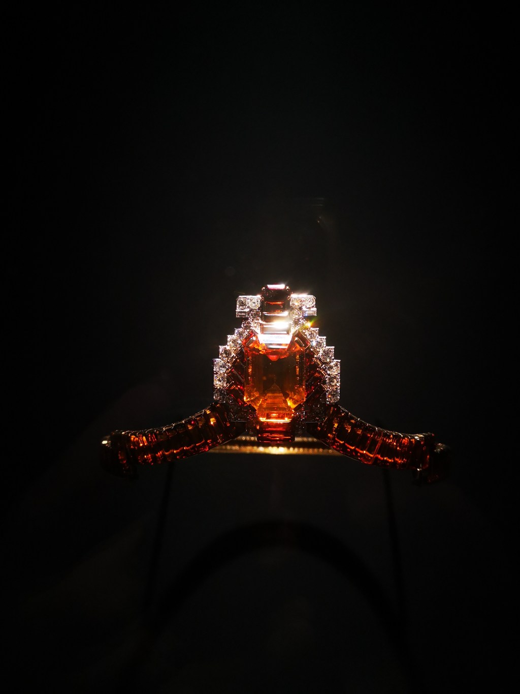
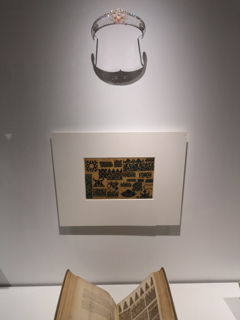
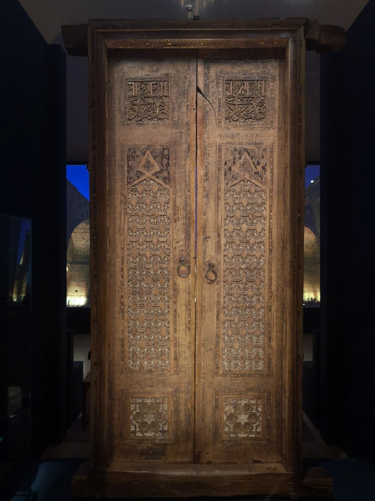
The exhibition biggest quality is the display of artworks from Uzbek collections, especially Tashkent and Samarkand. I don’t recall ever seeing these pieces in a French exhibition before, and I probably won’t have the opportunity to go to Uzbekistan right away, so it is a real chance to see these artworks displayed. The choice of the objects is thoughtful, some having been picked for their historical and /or emotional values, such as the original door of the Gur-i Mir in Samarkand, the mausoleum where lies the conqueror Timur. Other objects, also from Uzbek institutions, are simply stunning, such as what appears to be the plate of a larger bowl, in an alloy of copper casted, showing an inscription and a “harpy”. This piece really caught my eye.
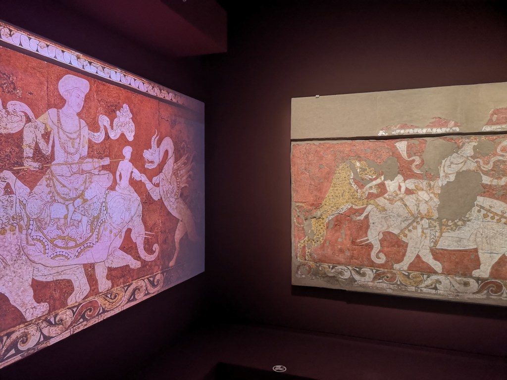
The exhibition is very ambitious, aiming at covering 14 centuries in two rooms, and I enjoyed the diversity of chronological eras. The route starts with impressive sculptures mixing Buddhist and Chinese influences, followed by the virtual reconstitution of Bukhara oasis put next to the Varakhsha fresco to highlight its original setting. Other portions of the fresco come on the screen following the reconstitution, as well as a third portion on the wall opposite the screen. This put this gorgeous fresco back in context in the best way possible. The chronology then moves forward to the first centuries of Islam, best exemplified by two folio of the “Katta Langar” Qur’an, a masterpiece amongst the earliest known copy of the text. Other pieces are more expected, such as Samanid dishes from 10th century Samarkand, but here again the selection is very qualitative. A bowl decorated with an incredibly elegant inscriptions that reads “Renunciation of desire is the noblest of riches” is particularly striking.
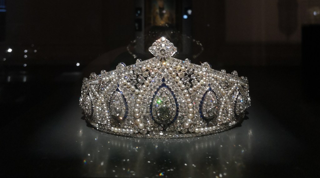
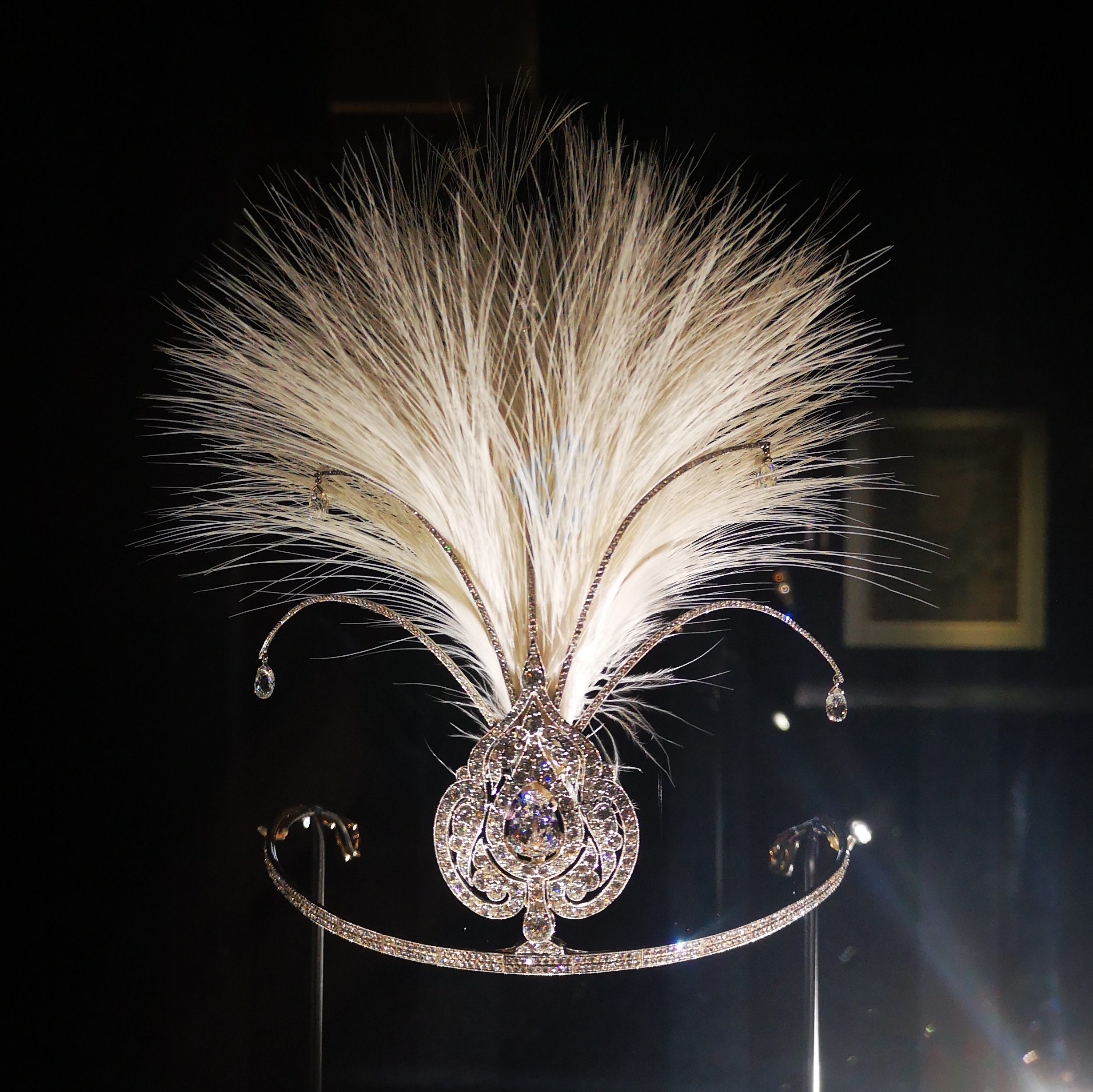
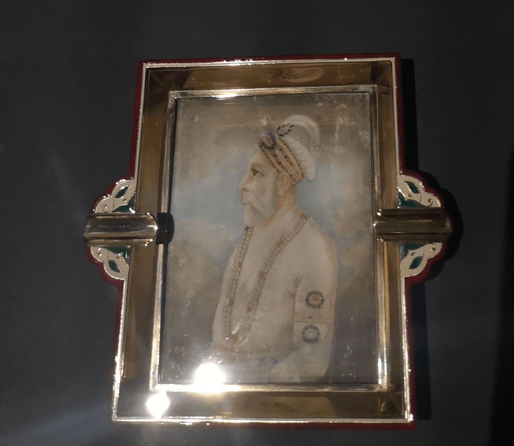
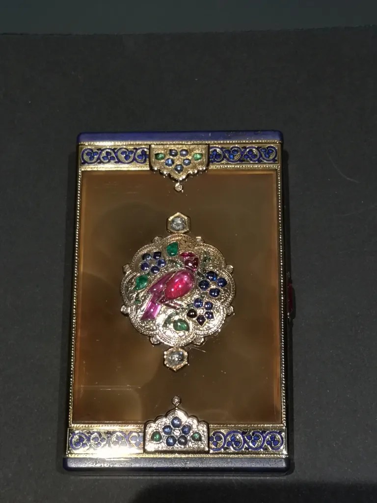
The second room offers a nice selection of medieval textiles and metals, as well as illustrated manuscripts from 16th century Bukhara, most from the Bibliotheque nationale de France in Paris. The exhibition closes with a large screen showing videos of the Shah-e zende in Samarkand, the necropolis of Timur and his descendants. Overall, the viewer will leave with the impression to have spent a nice hour or so amongst rarely seen treasures.
A final touch, the informed visitor can then go to the Islamic art department to south portion of the extraordinary “Paintings of the Ambassadors”, a fresco from the middle of the 7th century found in the ruins of Afrasiyab (north of Samarkand), landed by the Republic of Uzbekistan to the Louvre. I assume the large section couldn’t fit in the exhibition space with the required distance, but the signalling could have insisted more on its location, I only saw one sign at the beginning of the exhibition and nothing after.

I should have bought the catalogue
However, there were a few problems with the exhibition that made me twitch a little. The main one is the impression that the display of objects is only one half of a whole. I will preface by saying that I went through the exhibition catalogue very rapidly to check who participated in it, and no much more. This was a mistake I quickly regretted after leaving the room. Though I enjoyed the diversity of the exhibition, I left with the feeling that I was missing some crucial information regarding artworks I knew less about, as well as the main key to understand the intention and the coherence of the exhibition. Indeed, what is the link between the Paintings of the Ambassador and the door of the Gur-i Mir, beside their geographical location? Is there even a connexion? That answer might be in the exhibition catalogue, for which I would have to pay an additional €39, while I already paid €17 to see the exhibition. Some will say that all is not about money, but in this economy, I disagree. I am not saying exhibitions should be free, because Museum personnel need to eat, but an exhibition should be contained within itself and not depend on additional material. I understand that the reduced exhibition space allocated to the exhibit forced to make choices, but maybe more explicative panels, or a clearer route would have helped.

An inconsistent museography
I’m going to try not to be too picky here, but I must admit I was a little disappointed by some very avoidable mistakes. This is the Louvre, one of the leading museums in the world, so rigour should be key. Some labels have mistakes in their description, some are missing accession numbers and localisation (such as the harpy mentioned above), but one of the main issue was the absence of numbered references between the labels and the objects. Some displays hold several objects, but their labels are grouped on the side, so the viewer has to play “who’s who” to retrieve the reference. The displays are very minimalist and sleek, but it is detrimental to the readability.

As well, someone needs to explain why there is a security cordon 1 meter from the glassed displays in the first room; are people in the Louvre afraid of finger marks? This makes the objects barely visible and the labels unreadable.
The exhibition offers information on historical figures such as Marco Polo and al-Biruni, but they are difficult to see, being placed on the opposite wall or pillar of the display. This comes from the main issue of the installation: the division of spaces and the overall route. The two rooms and the corridor that compose the spaces are each divided in two halves, each half corresponding to a chronological period. It is particularly clear in the second room, where the display at the immediate left of the entrance is dedicated to the 11th to 13th centuries, and the display at the immediate right focuses on the 15th-16th centuries. In front of the entrance is placed the 15th c. door of the Gur-i Mir. Entering the room, the viewer would need to ignore the door, go left and to the back of the room, then cross in front of the giant screen toward the right where 15th-16th c. manuscripts are displayed, walk their way back toward the entry, then check the door in the middle and finish by the 15th-16th c. display at the right of the entrance, turn around and leave. This is a bit complicated but doable, except there is no indication that this is the most logical route and none of the objects are numbered. Entering the room, I went immediately to the display on the right, then realised the exit was next to it so turned around and went to see the door, then turned around again to the display left of the entrance, it was overall confusing.
Conclusion: Is it worth a visit?
If you’re in Paris and planning to go to the Louvre, go see this exhibition but also do manage your expectations and maybe get ready to invest in the catalogue. The absence of objects from Russian collections is regrettable but understandable and independent of the Louvre’s will, and could have been better filled from more objects from the Louvre, but overall the artworks displayed are worth the visit, especially those coming from Uzbekistan.

- From the film The Devil wears Prada.